- Hughesnet Community
- :
- Hughesnet Support Community
- :
- Your Thoughts on the Community
- :
- Re: Do not like new Community board
- Subscribe to RSS Feed
- Mark Topic as New
- Mark Topic as Read
- Float this Topic for Current User
- Bookmark
- Subscribe
- Mute
- Printer Friendly Page
Do not like new Community board
- Mark as New
- Bookmark
- Subscribe
- Mute
- Subscribe to RSS Feed
- Permalink
- Report Inappropriate Content
Do not like new Community board
I have checked the Community message board daily for topics that may help me get the best Hughes Net experience. This new way of seeing messages is not conducive to seeing new/recent discussions. I liked that the newest conversations always showed up first on the Community page. I also don't care for the new way of viewing usage history. If I saw a big jump in usage, I could check with my family members to see what they may have done to cause the jump. Maybe I'm missing something on how to read this new graph, but I haven't been able to view anything about this topic in the community. The way the discussions are displayed now does not feel fluid.
Solved! Go to Solution.
- Mark as New
- Bookmark
- Subscribe
- Mute
- Subscribe to RSS Feed
- Permalink
- Report Inappropriate Content
cwescott962,
Hughes has changed to this format as it's easier to actually sort topics out based upon the issue. So we now have different boards such as Billing, Tech Support, and so on. While this may seem confusing at first, it is actually a more traditional layout. The most recently posted in topics will appear at the top of the board that they are posted in, and there are stickied threads at the top of different boards that Hughes feels should be at the top so anyone can easily find information. I don't see them changing from this style in a drastic manor any time soon.
As far as the usage history, it now displays not what you have used on each individual day, but now shows what was remaining at the end of each day (need a mod to confirm whether it's end of day or start of day that it displays for each date). The status meter also uses this same style of graph now.
Thanks,
C0RR0SIVE
- Mark as New
- Bookmark
- Subscribe
- Mute
- Subscribe to RSS Feed
- Permalink
- Report Inappropriate Content
Replies consisting of anything other than text are more than a little wonky today.
- Mark as New
- Bookmark
- Subscribe
- Mute
- Subscribe to RSS Feed
- Permalink
- Report Inappropriate Content
The site sure is troublesome today.
- Mark as New
- Bookmark
- Subscribe
- Mute
- Subscribe to RSS Feed
- Permalink
- Report Inappropriate Content
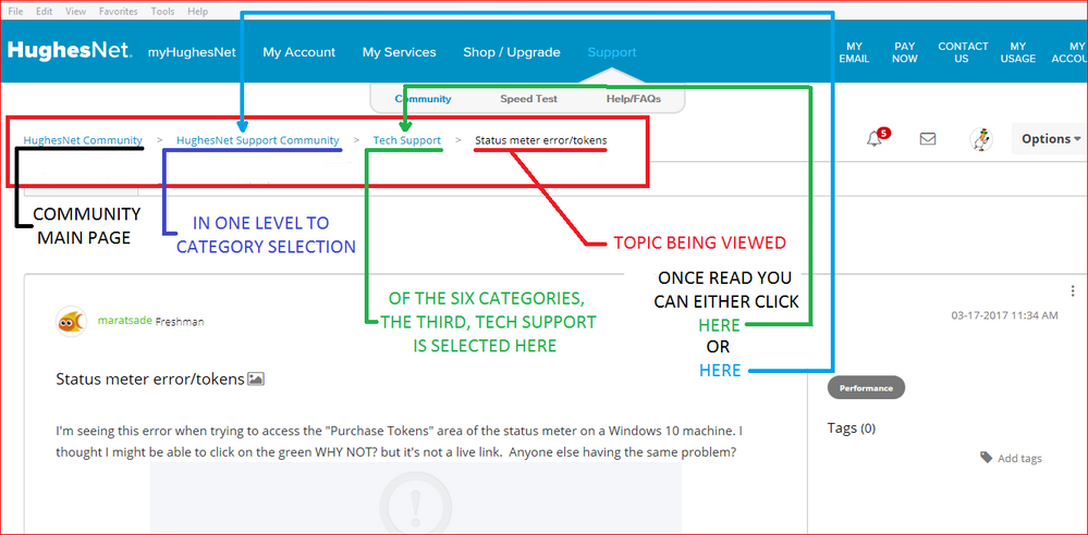
The site has underwent some changes. The biggest is that the Community no longer is one single page with the latest posts at the top.
Instead if you move in one level deeper to the HughesNet Support Community level you will see that the former single webpage has been broken down to include six subcategories.
If you select one of the six such as Tech Support you still find the latest topics at the top of the list begining after the pinned topics.
- Hughesnet Community
- :
- Hughesnet Support Community
- :
- Your Thoughts on the Community
- :
- Re: Do not like new Community board
